
EMPOWERING DATA ENGINEERS
WITH REAL-TIME INSIGHTS

⏳ FULL CASE STUDY - 8 MIN. READ | 📊 FINAL DESIGNS - 3 MIN. READ

IN COLLABORATION WITH
Unifying Global and Local
Health Monitoring
TAMING THE DATA DELUGE
THE CHALLENGE
WHEN MILLISECONDS MAKE MILLIONS
In the high-stakes realm of real-time data integration, every millisecond counts. Striim's data engineers were inundated with information streams, urgently needing a robust system to navigate the complex currents of system health and performance
Create a unified dashboard that provides real-time insights into both global system health and granular app-level details, enabling proactive decision-making in an environment where latency equals lost opportunities
WHEN DATA FLOWS, BUT INSIGHTS DON'T

ALEX
DATA ARCHITECT
EMPLOYEE
5+ years as a Data Engineer
Expert in SQL, NoSQL, data pipelines, cloud services
-
Deliver value to the company
-
Improve operational efficiency
-
Ensure data consistency, security, accuracy, and timeliness
-
Minimize time & costs spent on data pipelines
-
Automate repetitive tasks
-
Uplevel the business with new technologies
NEEDS & MOTIVATIONS
USER PAIN POINTS
Addressing data quality, freshness, and overall operational health
Diverse factors affecting performance optimization
Varying troubleshooting preferences among users
Difficulty in identifying environments and nodes for multiple Apps
Challenges in optimizing performance across diverse data sources
Difficulty in addressing data quality and freshness issues holistically
Time wasted switching between different tools for global and local monitoring
Struggle to identify which environment and node an app is on when managing multiple environments
MY APPROACH
FOR GLOBAL
DASHBOARD
Determine the aggregate health of all Apps in the production environment
Enhance system reliability, minimize downtime, and prioritize critical tasks
Comprehensive visualizations highlight Apps not meeting checkpoints, provide insight on Apps with the most lag, and enable preventive actions or debugging.
DATA VISUALIZATION DESIGN
DISPLAY KEY METRICS AND KPI'S IN A DIGESTIBLE, EASILY COMPREHENSIBLE MANNER USING CHARTS, GRAPHS, AND OTHER VISUAL AIDS RELEVANT TO THE NEEDS OF DATA ENGINEERS

Market Research
WHAT
DID WE DISCOVER?
CHARTING THE COURSE


Informatica
FiveTran
Hevo
MuleSoft
SnapLogic
Most competitors lack a unified view of global and local health metrics
Real-time data visualization is often limited or delayed
2
User customization options are generally restricted
1
3
USER INTERVIEWS
WHAT DO THE ENGINEERS SAY?
Failure to address data quality leading to business user complaints

Complex performance optimization due to diverse data sources

Varying troubleshooting preferences among users

Difficulty in identifying app environments and nodes

Checkpoint
Events
Alerts
NodeCluster
Name
Namespace
Status
BackPressure
(Yes/No)
Checkpoint
DataSource
Operational
State
NodeCluster
ID
TimeStamp
Associated App
Status
(Pass/Fail)
Apps running
Cluster Name
Cluster Size
(small/meduim/
large)
Type
Source
Alert
TimeStamp
(Begin/End)
Urgency
Cluster level
App Level
Failure alert
(related to events )
or some transaction
failed - if it fails the
system resets it to
the nearest checkpoint
Date
Timestamp
Performance
App Server
CPU %
App Rate
Server Memory
Consumption
Lag Time
Load Balancing (within the cluster)
Cluster health metrics
Data
Events Processed
Read/Write
deviation
A N A L Y T I C A L
Maximum CPU
Maximum
memory
Read (source)
Write (target)
T R A N S A C T I O N A L
App
CONCEPTUAL MODEL
TO BREAK DOWN THE INFORMATION INTO SIMPLER NAVIGATIONAL ATTRIBUTES
Attribute
Measure
Dimension
BackPressure (yes/no)
Checkpoint
Operational State (Created/ deployed/ running/ stopped/ terminated)
Performance
App Rate
App Server CPU %
Server Memory Consumption
Degree of delay
Namespace
Quantity: number of occurrence
Volatility: Checkpoint frequency
Volatility: Status of app
Volume: Performance of the app
Volume: Rate at which events are processed
Volume: CPU core/ database server load
Volume: amount of memory consumption
Volatility: delay in processing data
Volume: Namespace storage usage
Component creating back pressure
Number of operations successful
Text (Created/ deployed/ running/ crashed)
Number of apps written
Number of apps processed per unit time
% of system load
MEASURE DIMENSION MATRIX
For easier segregation of quantitative data into graph & determining x-axis v/s y-axis
Object : App
Usage by app
Delay in time - read/write target system
Storage size used by apps
SYSTEM CHECK
WHERE ARE THE WEAK POINTS?
Evaluated existing Striim interface against Nielsen's 10 usability heuristics
Lack of system status visibility
Users struggled to get a quick overview of all applications' health
Users found it difficult to switch contexts smoothly
iNCONSISTENT NAVIGATION BETWEEN GLOBAL AND LOCAL VIEWS
The interface presented too much data at once, making it hard for users to focus on critical information
INFORMATION OVERLOAD
A dashboard is a visual display of the most important information needed to achieve one or more objectives; consolidated and arranged on a single screen so the information can be monitored at a glance.
Attribute
Measure
Dimension
Status
Lag Time
Reliability: events processed or not
Volatility: degree of delayness
Text : Pass/Fail
Number of checkpoints achieved by an app
Object : Checkpoint
Attribute
Measure
Dimension
Cluster Size
Maximum CPU
Maximum Memory
Volume: Storage size of apps in it
Volume
Volume
Small/ Medium/ Large
Object : NodeCluster
HOW DID I BUILD IT?
BLUEPRINTS TO REALITY
Created an information architecture model breaking down data into navigational attributes
Developed a measure dimension matrix for data segmentation and visualization
Implemented Ben Shneiderman's visualization theory
Engineered features like data export, alert indicators, customizable dashboard layouts


WIREFRAMES AND PROTOTYPES
FROM SKETCHES TO SCREEN

Continuous representations of the objects and actions of interest with meaningful visual metaphors


Rapid, incremental, reversible actions whose effects on the objects of interest are visible immediately
Physical actions or presses of labeled interface objects (e.g. buttons, sliders, etc.) instead of complex syntax

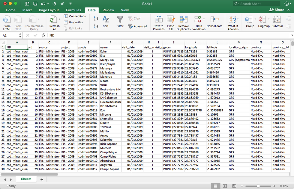
Freedom to view data in
preferrable format

View graph in excel format
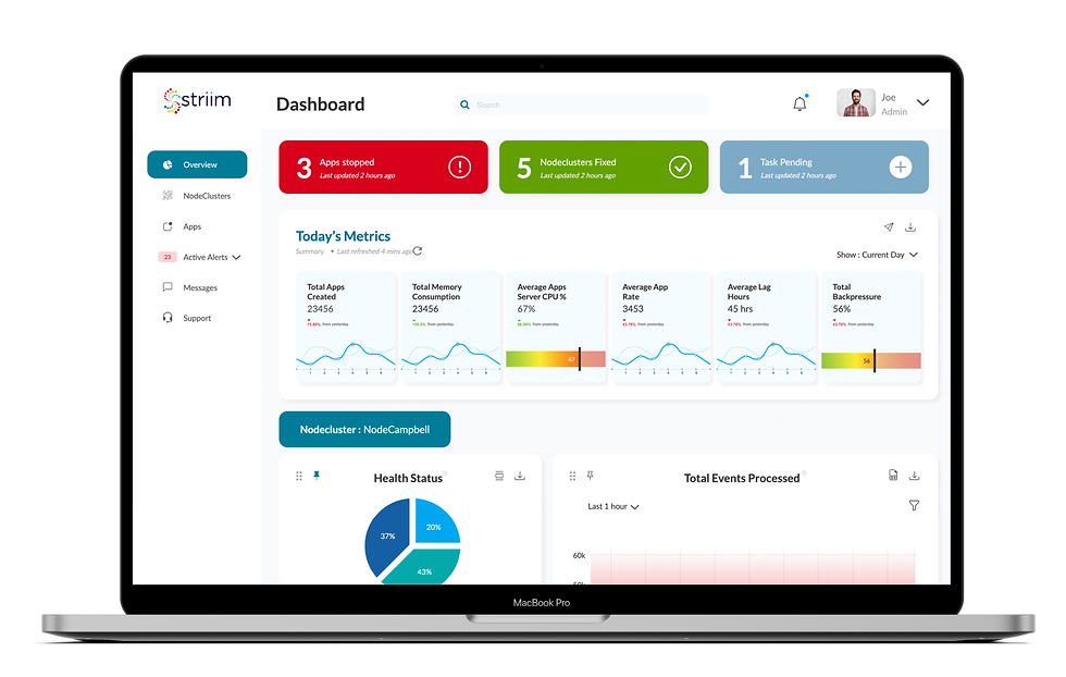
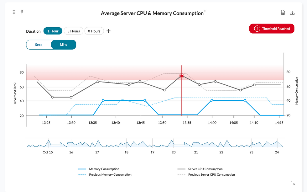
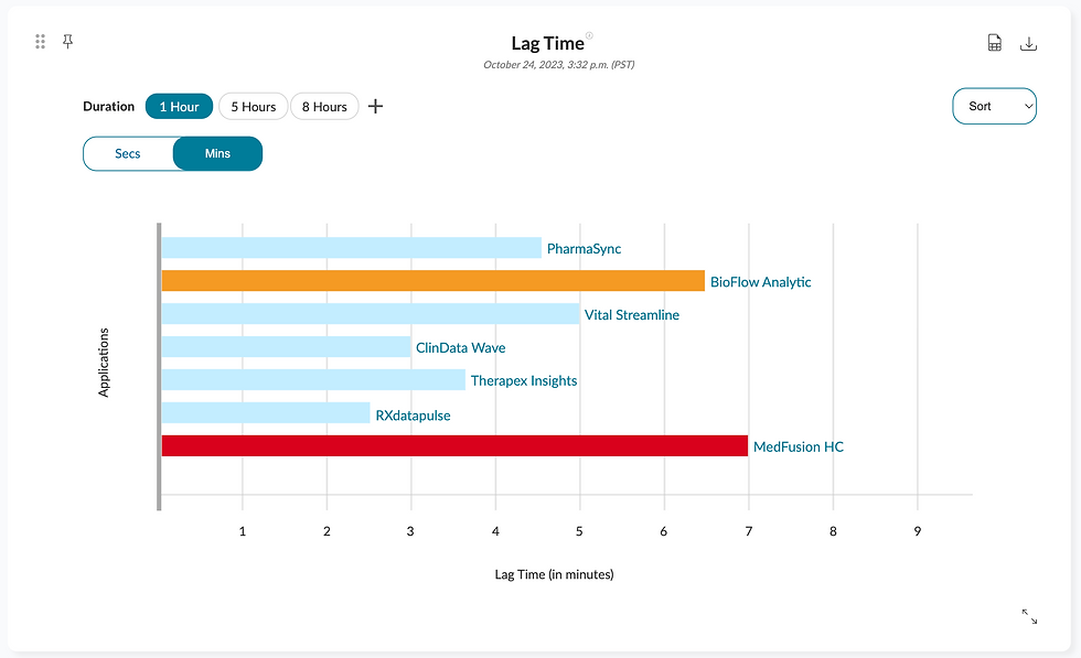
Alert indicator with a red zone area for quick visibility
Freedom to pin, move, and arrange charts as desired
Dropdown 'Active Alert' notifications for quick view
Quantified number of alerts quantified for rapid insight
FEATURES AT GLANCE
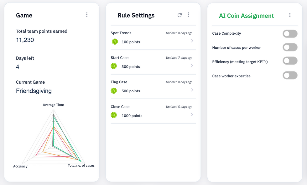


UX/UI redesign to enhance system reliability and streamline complex data operations
HOW DID IT PERFORM?
RESULTS AND OUTCOME
Conducted 5 Usability Testing Sessions with Data Engineers
Users appreciated the unified view of global and local health metrics

The ability to take actions directly from the dashboard was highly valued
Some users found the initial information density overwhelming
Key Findings :
PROBLEM STATEMENT
Data engineers at Striim faced multiple challenges
WHAT'S THE ROOT OF THE PROBLEM?
NEW MODIFICATIONS
ITERATIONS AND FEEDBACK
Implemented progressive disclosure for detailed information

Added customizable dashboard layouts to cater to different user preferences

Advanced search and filter options for easy navigation and data exploration
THE BOTTOM LINE
IMPACT
30%
20%
REDUCTION IN SYSTEM DOWNTIME
INCREASE IN USER PRODUCTIVITY
FASTER ISSUE RESOLUTION
25%
This new interface is a game-changer. I can now monitor our entire data ecosystem and drill down into specific apps with unprecedented speed and clarity.
"

HOW DID WE ENSURE ACCESSIBILITY FOR ALL?
INCLUSIVE DESIGN
Implemented color-blind friendly color schemes
Added screen reader support for critical data points
Designed with responsive layouts for various screen sizes
WHAT'S ON THE HORIZON?
FUTURE ITERATIONS AND NEXT STEPS
AI-powered anomaly prediction
Expanded system-generated annotations for performance metrics
Enhanced collaboration features for team-based troubleshooting

UI/UX Design
Information Architecture
Prototyping
Wireframing
Striim
Axure RP
Miro
Adobe Suite
Google Analytics
CLIENT
TOOLS
RESPONSIBILITIES
2 Months Sprint
TIMELINE
Striim UX Team
Prof. Rosenberg
TEAM